Judge a Book by Its Cover
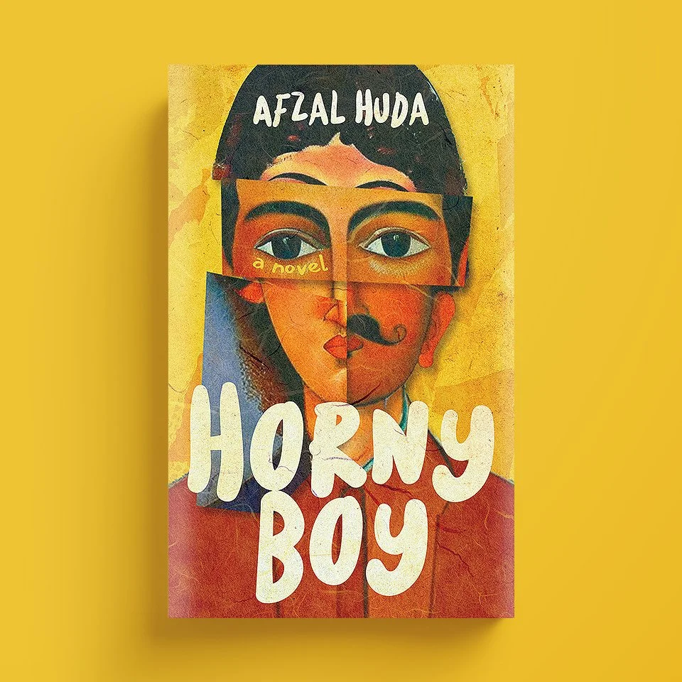
Note: Join me in this creative journey where I go behind the scenes of designing a book cover for my debut novel, Brown Boy Barely Blossoms. Initially the book was titled Horny Boy, but I changed it. If you’re interested in learning more about how I came up with the current title, you can read the story here. I will continue to update this blog post until we have the final image.
the back story
I have never shared this story before. It all began eight years ago when I hit rock bottom. I was depressed, hopeless, and suicidal. This is how it all ends, I thought.
“You should write a novel,” my younger brother said. “Isn’t that what you always wanted to do?”
“No one’s gonna read that shit,” I sighed.
“I will,” he smiled, “I promise.”
So, I did. And I’m grateful to him for being there for me when I needed him the most. Writing this book saved me, and changed my life, forever.
The funny thing is that even though I was depressed, I wrote a coming-of-age story that used humor, go figure. I wrote the first draft of the novel in a few months, so then why did it take so long to get to the final manuscript. It was my perseverance, or the lack thereof. I let the manuscript collect dust for years. The actual work started a few years ago, when I was exploring the French Alps, and met an incredible writer, Natasha Fracchiolla. I don’t know what powers she possessed, but she rekindled my soul, held my hand, and touched my heart. “You were meant to do this,” she said, “you need to publish it.”
I believe it’s time for me to bring this idea to life.
how to design a stunning book cover?
Now that the writing is complete, it’s time to start thinking about the cover because let’s face it, we all judge a book by its cover.
I have been researching book cover designers, and yes one day I’ll ask Chip Kidd to design the covers of my books, but for now I found the perfect talent. The first thing I did was send him the blurb that would go on the back cover of the book, to see what he thought about the project. Let me share it here as well:
back cover blurb
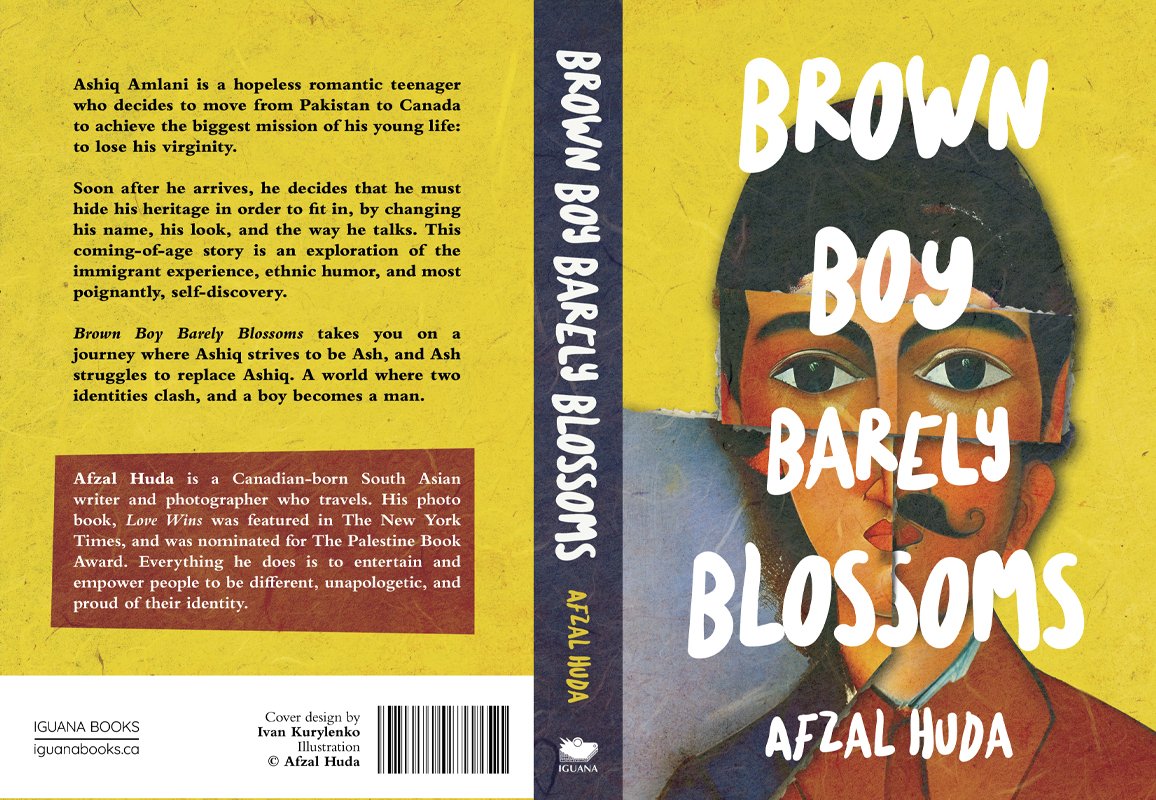
Ashiq Amlani is a hopeless romantic teenager who decides to move from Pakistan to Canada to achieve the biggest mission of his young life: to lose his virginity.
Soon after he arrives, he decides that he must hide his heritage in order to fit in, by changing his name, his look, and the way he talks. This coming-of-age story is an exploration of the immigrant experience, ethnic humor, and most poignantly, self-discovery.
Brown Boy Barely Blossoms takes you on a journey where Ashiq strives to be Ash, and Ash struggles to replace Ashiq. A world where two identities clash, and a boy becomes a man.
early stage
The book cover designer will initially provide me with a bunch of raw concepts, and then based on my/your feedback, we’ll correct our direction/look/idea.
“Your feedback is very important to me,” he told me, “I need to know what you like about the cover, and equally important - what you dislike.”
For now, he has given me a small task: to create a Design Brief.
A collection of 5-10 book covers that I like, with a small description of what I like about them. This is to evaluate my visual style and taste
A list of any prominent images, elements, objects in the book
The most important scenes (for example, when you think about The Lord of the Rings, you immediately imagine a ring, an eye on the tower, figures walking through the hills. The Shining - a typewriter, a detached mansion, two little girls in the symmetric corridor. You get the idea)
Here’s what I sent him:
the design brief
I’ll start with a quote from one of my favorite creatives, Debbie Millman, the American writer, educator, and the host of Design Matters:
“People do not read first. First and foremost, they see color. Then they see numbers, then shape, and then, if you still have their attention and they understand what you put in front of them, then they will read.”
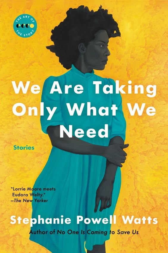
I have shortlisted the following book covers based on this idea, which I also want to incorporate in the design process of creating the cover of my novel.
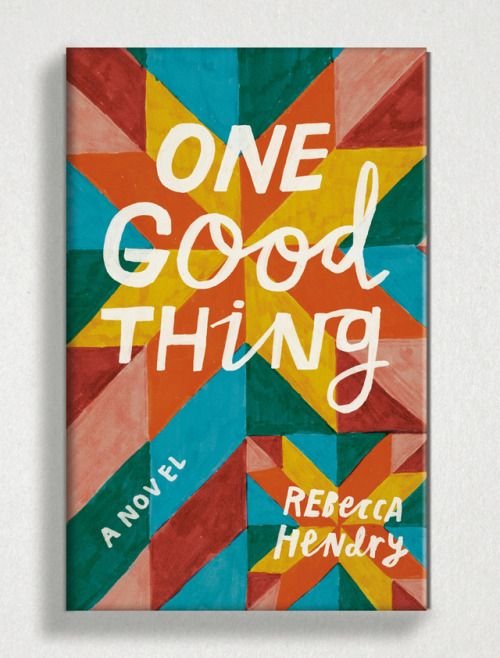
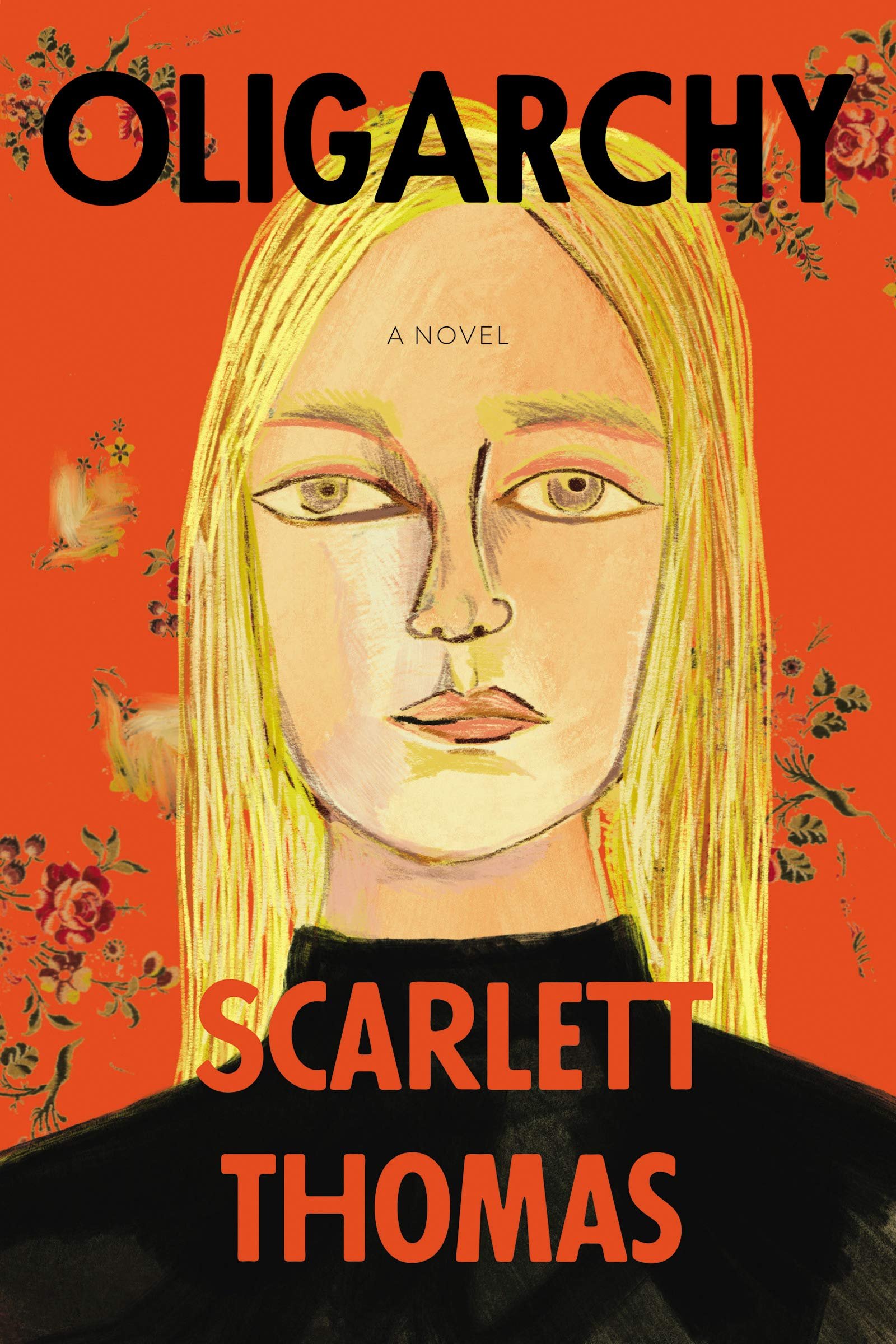
use of color
I like the gold/yellow/red color. It gives me a feeling that these books must be fresh, personal, and funny, just like my book
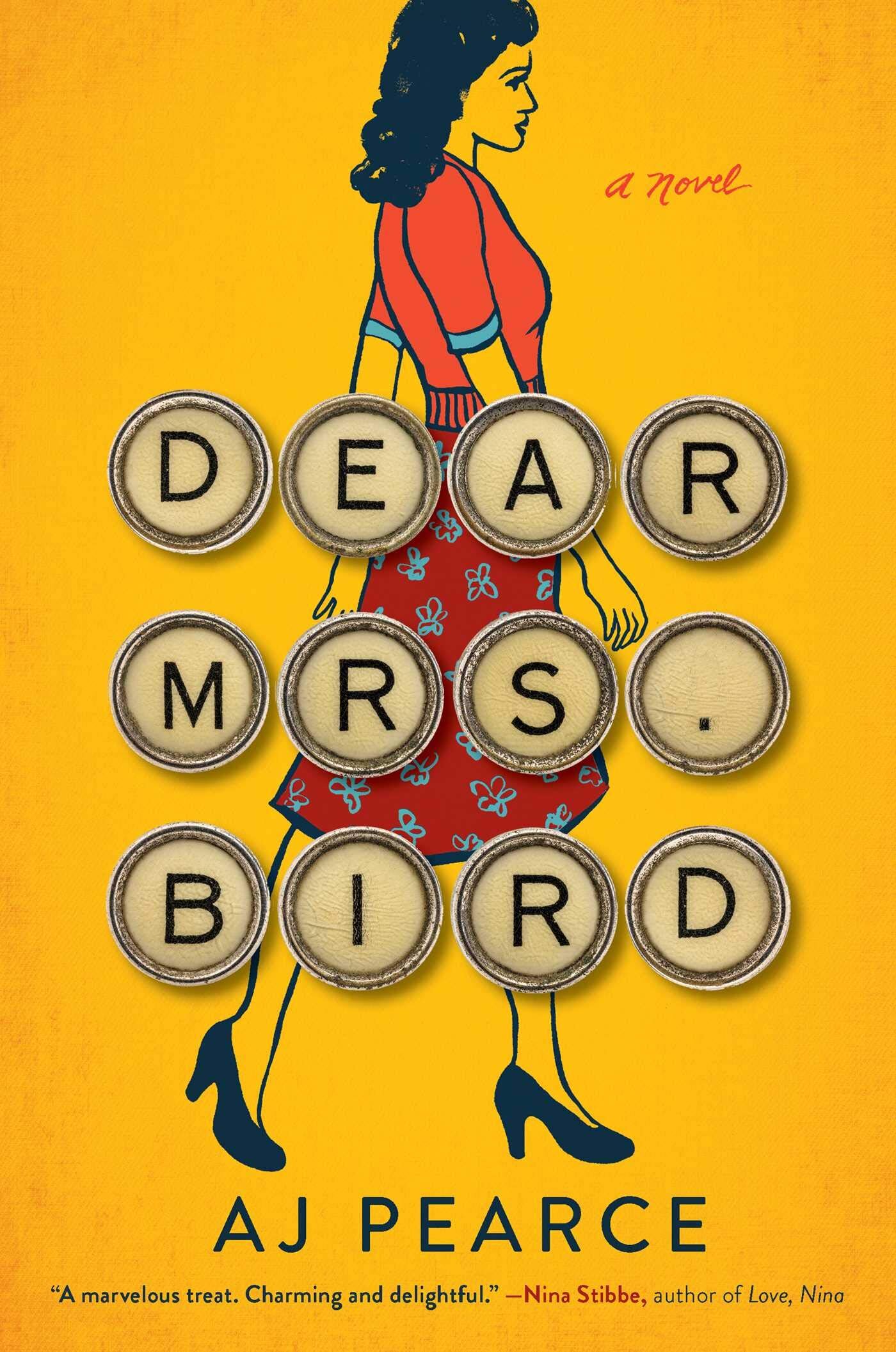
white typography
I really like the white typography for titles
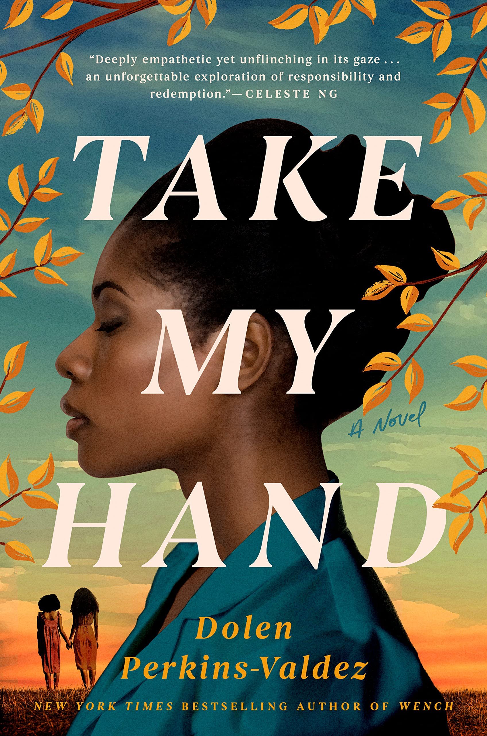
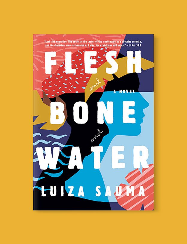
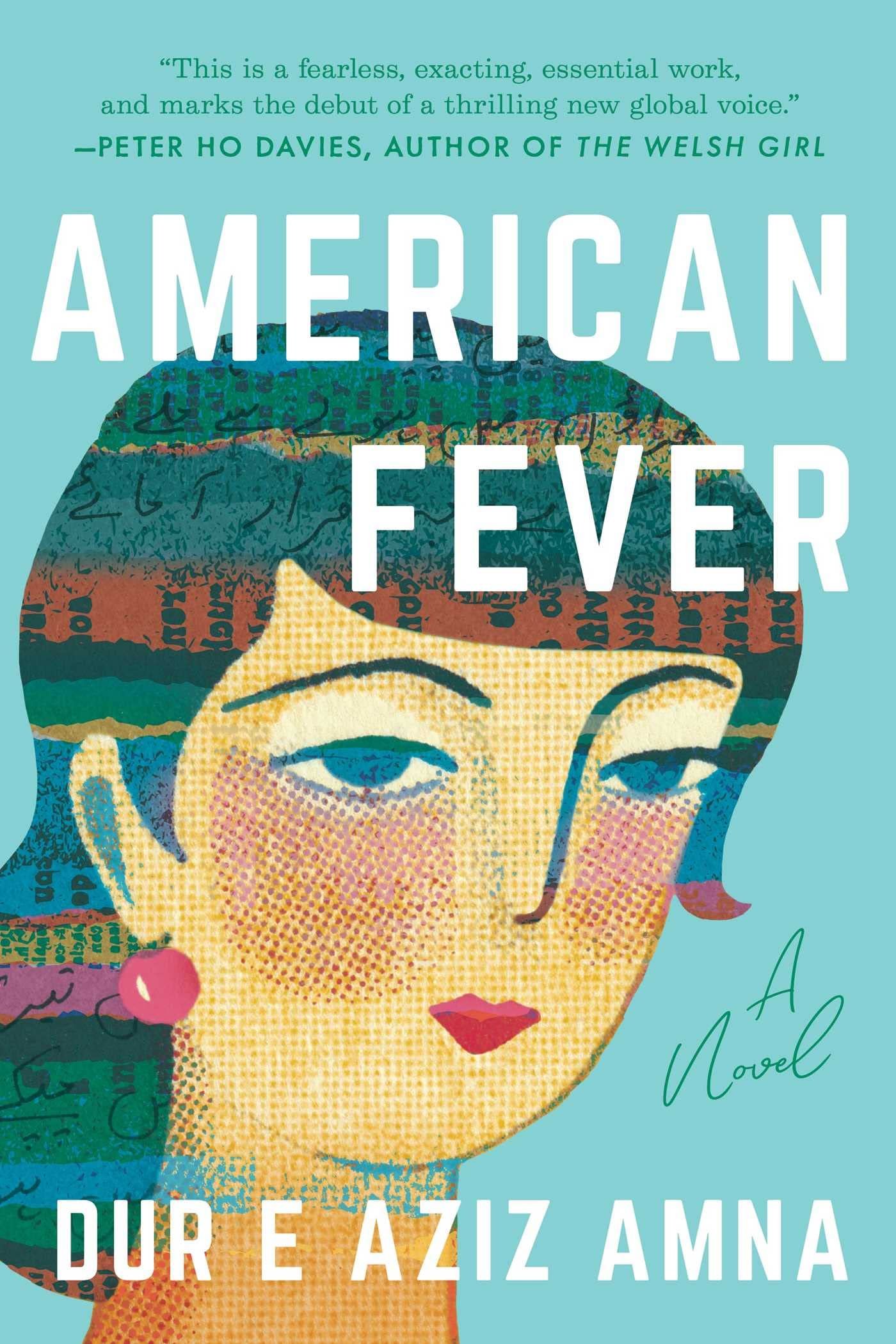
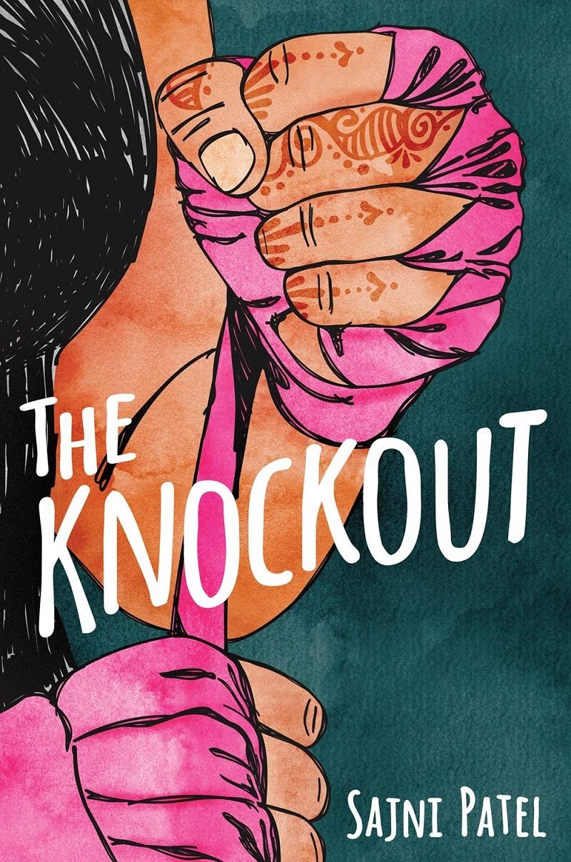
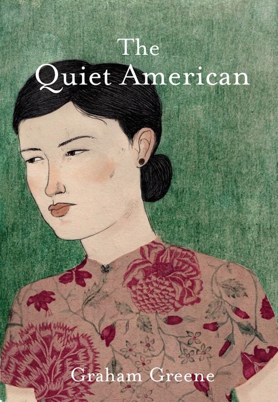
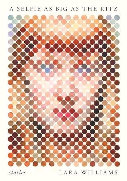
portrait as identity
I’m drawn to covers that use portrait of the protagonist, to highlight their identity
Identity is also one of the main themes of the novel. The protagonist, Ashiq Amlani hides his heritage, in order to fit in
In the first cover, American Fever, I like the foreign characters in her hair. Ashiq Amlani also deals with language issues
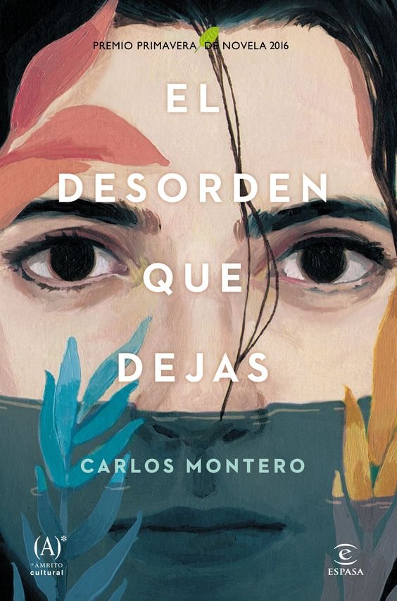
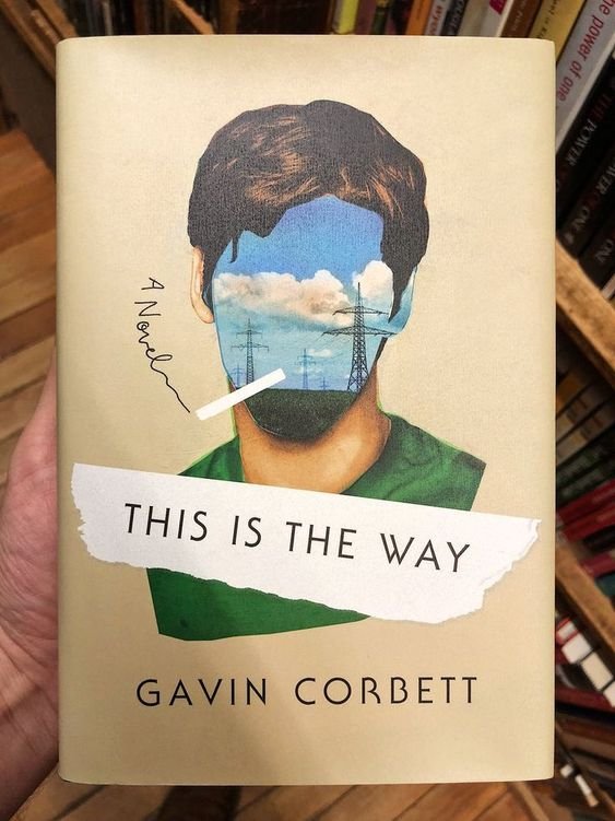
I also like the hand drawn/painted portraits instead of the digital graphics. Especially because the novel is set in the late 90s
In The Knockout cover, I like how the henna on her fingers reveal that she has South Asian heritage
prominent images, elements, objects

A YELLOW SONY WALKMAN
There is a scene in the novel from his childhood. The year is 1988. It’s his 10th birthday, and he receives a yellow Sony Walkman from his aunt.
Note: Later in the novel, when he is a teenager, there is a scene, where he tells his friend (whom he also secretly loves) about his childhood Walkman. She lends him her Disc Player for the night. Eventually he buys his own new portable Sony Disc Player. Whenever he gets dumped by a girl, he listens to sad songs.
I found an image of an original hand carved Lino print of the same Walkman done by James on Esty, who owns BARNESandBRAYERS store.
Of course we cannot use this exact image, but I wanted to include this here for inspiration purposes only.
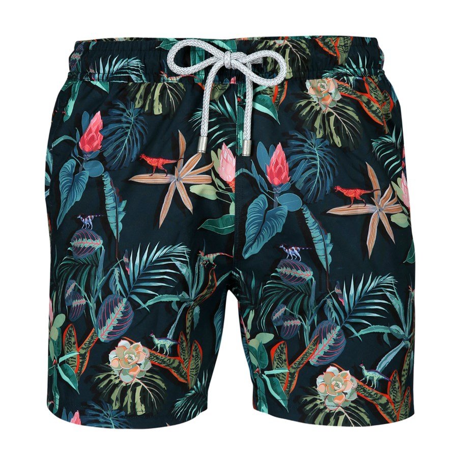
SWIMMING TRUNKS
There is a scene in the book, when he buys the most expensive pair of swimming trunks, to impress a girl, even though he doesn’t know how to swim.
When he shows up at the pool, he finds her making out with another guy. When she sees him, she makes fun of his hairy legs. So he goes back to his dorm room, and shaves his legs hahaha.
Note: This is just a sample image. The swimming trunks in the book are navy blue, features feathers and leaves in yellow and turquoise colors.
most important scenes
at the end of a ski trip
I believe this has the potential to be a funny setting for the cover.
Setting: Ashiq Amlani goes to Lake Louise, a beautiful ski town in Western Canada, to ski with his friends. But he doesn’t know how to ski, so he gets a ski lesson, makes a fool of himself, and goes back to the hotel disappointed. When he enters the room, all of his friends burst out laughing, because he looks like a clown wearing layers and layers of wrong clothes. No one ever taught him how to dress properly for skiing.
Image idea: He is sitting in the jacuzzi wearing his ridiculous clothes, and holding his broken skis. Behind him is floor-to-ceiling windows that oversee the majestic Rocky Mountains.
shaving his moustache
He is told by his aunt that the reason none of the girls are interested in him is because of his ridiculous moustache.
Setting: He returns to his hotel room, goes to the bathroom and shaves off his moustache.
Image idea: He is looking at his reflection in the bathroom mirror, which is a bit fogged up due to the steam from the bath. Maybe half moustache is shaved off.
surprise at the hotel
Someone knocks on his hotel room. Ashiq Amlani opens the door, and finds a man. The man’s wife is in Ashiq’s bed.
Setting: Ashiq is shocked to see the man, especially because Ashiq is only wearing his underwear and nothing else. So he puts his hands in front of his crouch.
roof of the library
Ashiq Amlani is on the roof of a Vancouver public library. He meets two white teenagers who make fun of his accent. One white teenager has a shaved head, another one had blond surfer hair and blue eyes.
Setting: The white teenagers have their skateboards with them, and are smoking weed. They make fun of Ashiq. The landscape has skyscrapers, and a huge billboard of The Simpsons can be seen.
This is all the information for now. If the designer asks for more, I’ll update it here.
your suggestions:
Please let me know what you think in the comments below. I really want all of you to be a part of this process. I would really appreciate your feedback and ideas during this stage. Thank you!
Acknowledgement: In order to achieve great things, you need great people in your life. I’m fortunate to have such people, especially when I need them the most. Here’s something I wrote to show my gratitude for everyone that helped me bring this idea to life. This will be included at the end of my novel, but knowing that some of these people may never read my book, I thought I’d include it here:
This book wouldn’t exist if it wasn’t for my brother, Faisal, who inspired me to write my first novel. I still remember the day when I was depressed and clueless about what I wanted to do with my life, and he said, “You should write a novel. Isn’t that what you always wanted to do?” So, I did. And I’m grateful to him for being there for me when I needed him the most. Writing this book saved me, and changed my life, forever.
I would also like to thank my wonderful editor, Annie Tucker, who taught me everything I know about writing. You know the saying: when the student is ready, the teacher will appear. That’s how I feel about Annie. She is a Godsend.
An enormous thank you to my dear friend, Natasha Fracchiolla, for rekindling my soul. She picked me up, held my hand, and touched my heart.
A huge thank you to all my first readers, especially Donna Serafinus, who helped fill the gaps and made this book a thousand times better.
Initially, this novel was part of a transmedia project, which failed. Since then, I learned that making mistakes was good; the process was what mattered the most. I met some amazing people on that journey, people who shared their creativity and their insights with me. I believe that everything happens for a reason, and now I know what I had to go through to get where I am now. I would like to thank everyone on that team, especially Ambreen Hooda, who spent months on the content edit. Saqib Khan, for his creative vision. And Farhan Shah, for his incredible music. I would also like to thank all the people that supported that project financially, who believed in me and my creativity. Thank you all from the bottom of my heart.
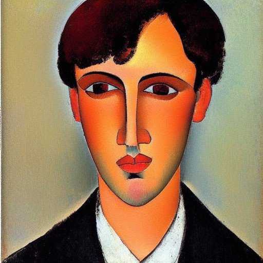
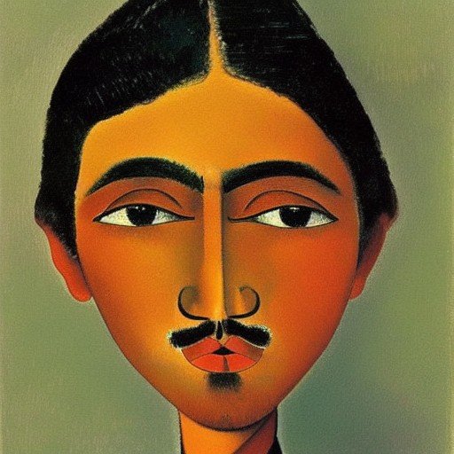
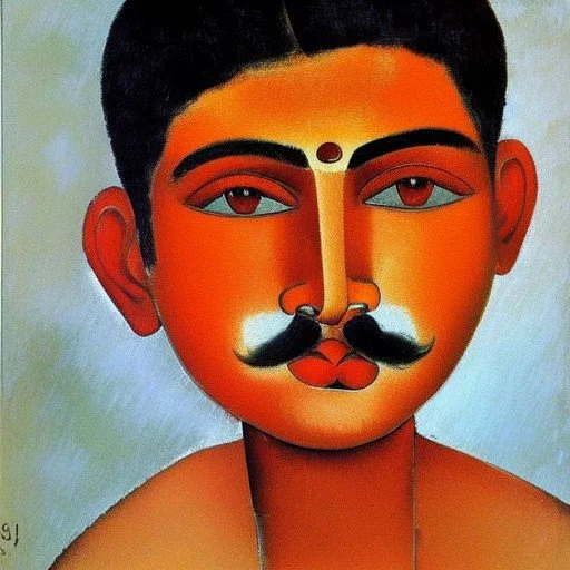
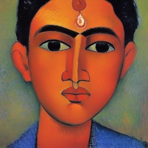
first four concepts
This is what the book designer sent me, and asked for my feedback:
my feedback to the designer:
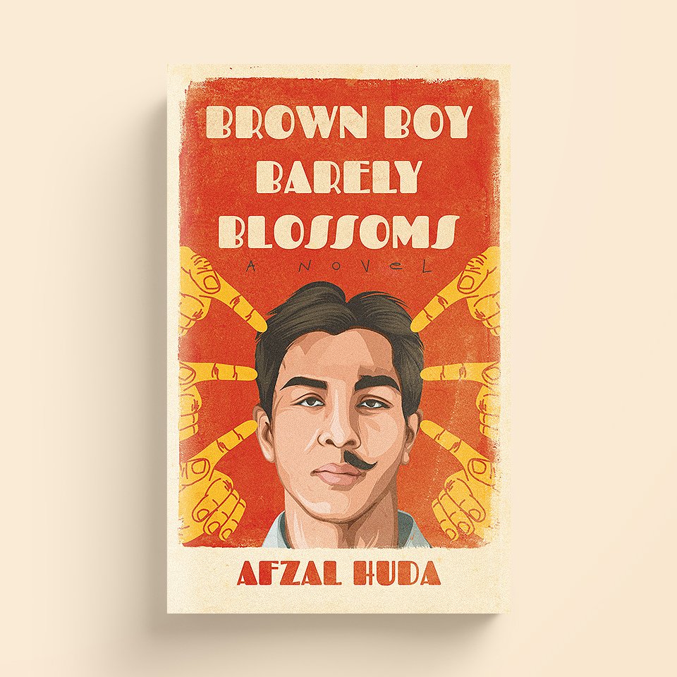
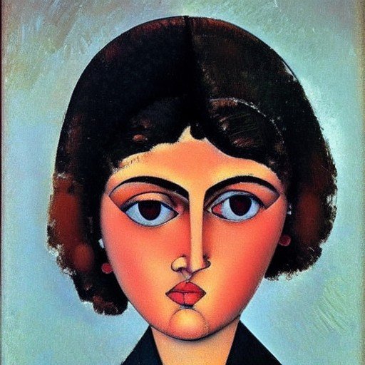
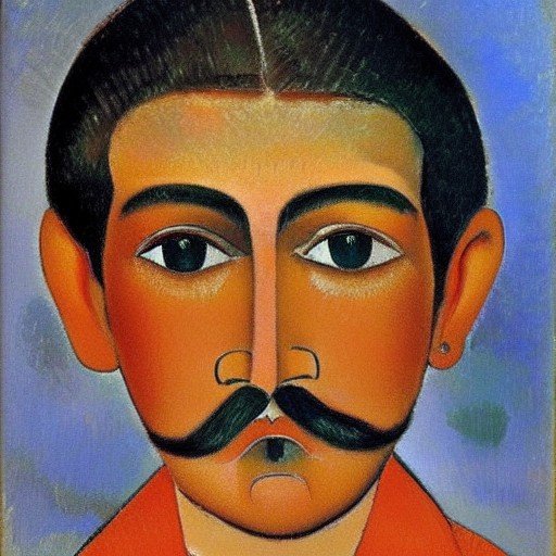
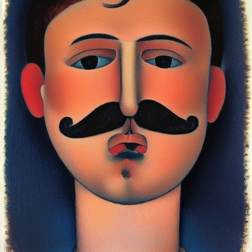
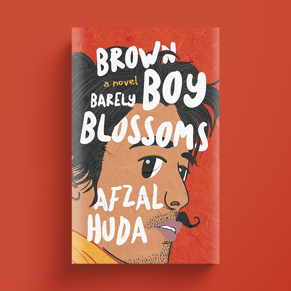
cover #1
I love this cover, mainly because it comes off as funny. The half moustache idea works really well. However, I feel that the eyes need more work. We need to do something with them, so that they entice the audience. Also, the eyebrows need to be refined (but that’s a minor detail that can be fixed at a later stage.) Love the bold white typography.
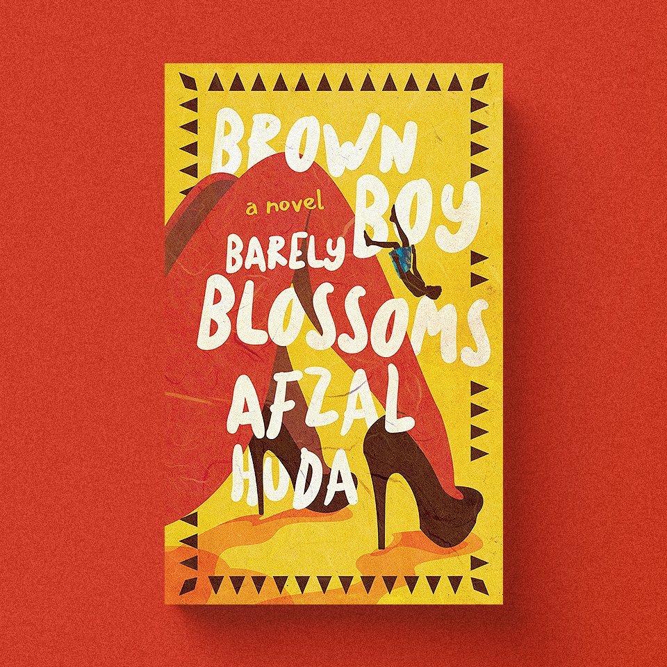
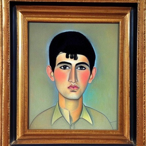
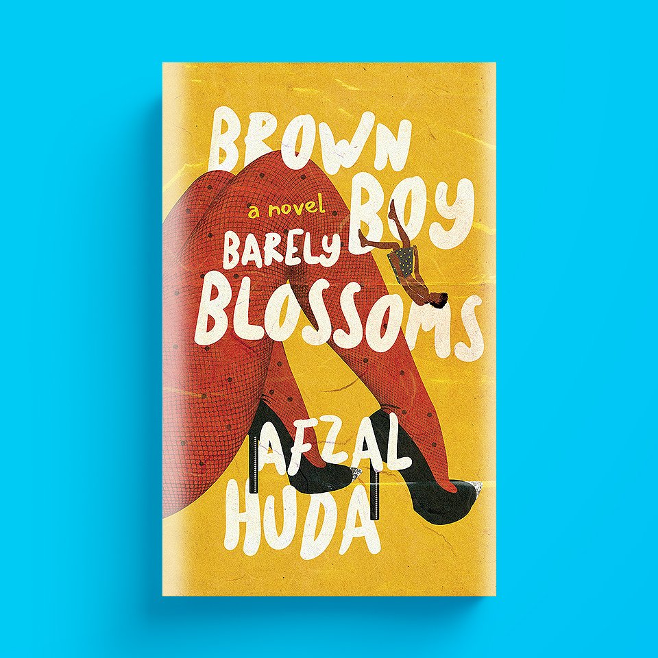
cover #3
Have you watched the TV series Mad Men? This cover reminds me of the title sequence of the show, which is not a bad sign. Love the falling guy idea, but we need to make him more detailed. Maybe incorporate the half moustache idea here. He is too dark (initially I didn’t even see him.) We should make him more like the guy in the #1 cover. Also, the shoes of the girl are not the right kind, we need to change them but keep it sexy. Define her butt more, so that it looks more sexy. And maybe change the yellow background to a different shade.
another idea
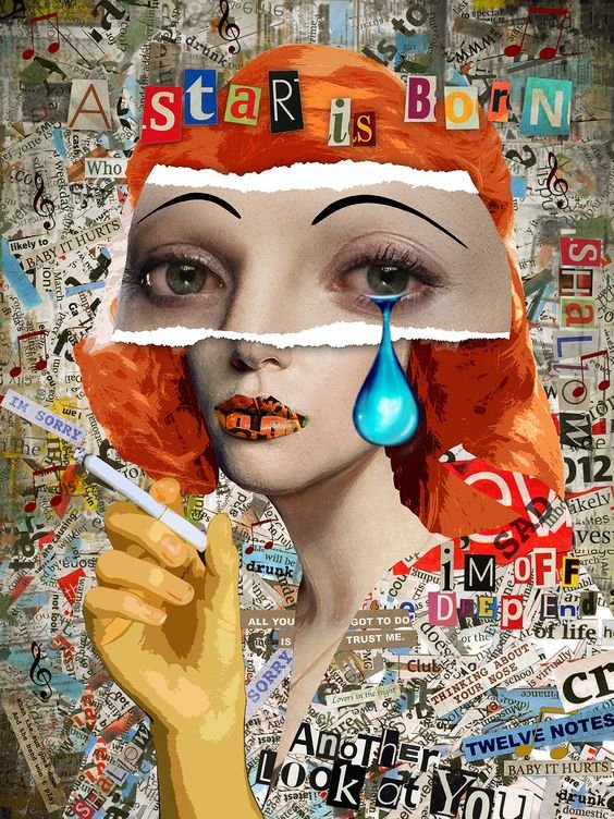
Have you watched the TV series Godfather of Harlem? They have used the collage technique. Could you also please come up with a rough concept based on this technique. I think creating a portrait would work really well because the protagonist in my novel has identity issues. He pretends to be someone else. He hides his real self. Please watch the title sequence. It’s a bit dark, so you’ll have to change the colors of course to keep our concept fresh and fun:
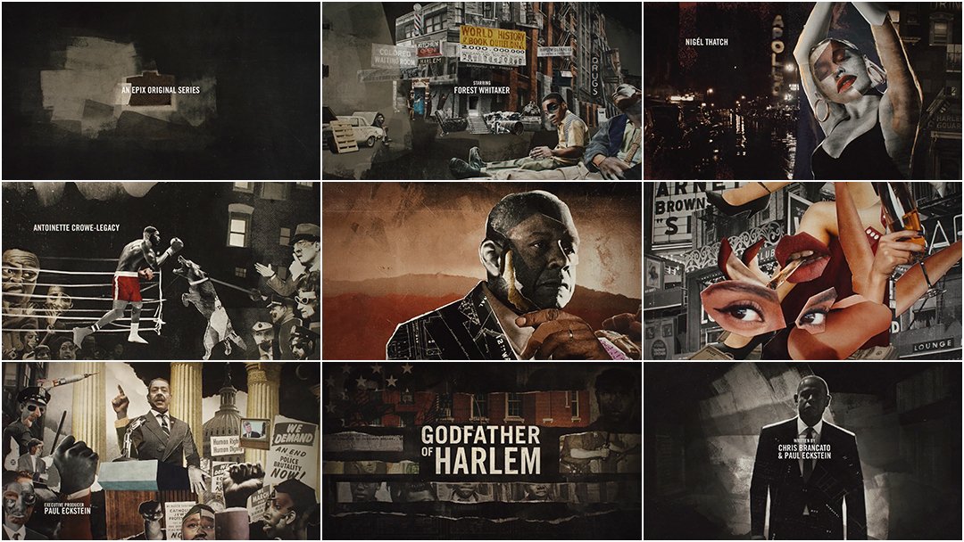
Looking forward to what the designer would come up with next!
It’s September 2nd, 2022.
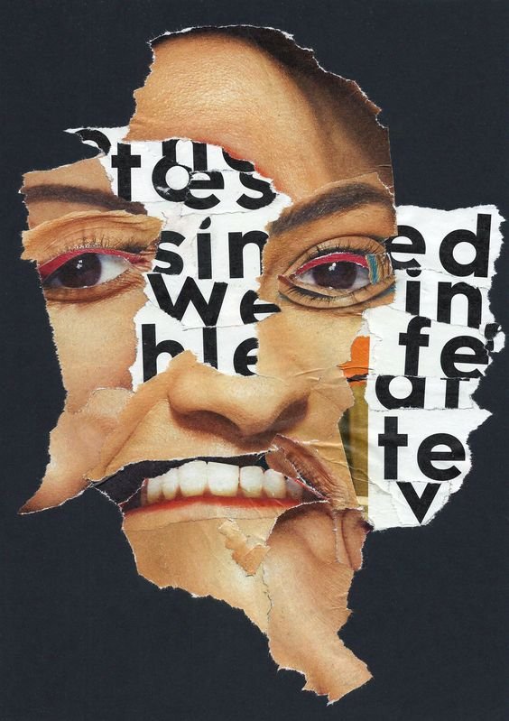
I just got the new rough concept from the designer, based on the visual idea from the title sequence of Godfather of Harlem.
The designer said, “We can treat this as a sculpture, and take off what’s not needed.”
My immediate thoughts were:
Looks promising
But the guy appears very old. The protagonist is an 18-year-old boy
Even though the collage is made of many images, it doesn’t tell me anything. Each image should be significant
The gestured hand at the bottom is too much
I think we need to simply the overall concept (so that the viewer can follow a pattern - like where does our eye go first, and then where does it lead to next, and then next)
What do you guys think? Let me know in the comments bellow. Thank you!
It’s September 6th, 2022
I received this new simplified version, which doesn’t grab me at all. The designer suggested that we go with the earlier version, instead of the new simplified one. In the earlier one, we could rearrange the elements, and make the guy appear younger.
I agree that the earlier version is better, however, I feel that it won’t be easy to make it look fresh and funny. Also, the face should be a collage itself (not just the eye.) Let’s see what the designer comes up with next.
my feedback to the designer:
I agree with you that the earlier version has a better look, however, I feel that it requires a fresh take on it. For a cover like this, we will need each element to be distinct, yet an organic part of the whole. It's not easy to do, but you love this style, so I think we can give it another try. I showed this version to a lot of my readers along with the other covers you drafted. Majority of them prefer #1 and #3, but they also think that this new idea can go somewhere amazing.
Here are some thoughts:
Eyes: I believe this is the most important part of the cover, so we need to nail it. I think it will be powerful if the eye is looking at us. Also, the eye should be colored.
Face/Identity: His face should be made up of different elements (not necessarily realistic photos). Like a hand drawn colored eye, black and white photo of nose, colored lips. Together they form his identity, but you can tell that all those parts are from different bodies. This is the most difficult part, because the elements will have to compliment each other. If we can make this happen, then I believe we will have an award-winning cover!
Moustache: I had an idea today. Let me know what you think. We can have a girl's lower body (butt and leg) in black color, and make it look like a moustache. Especially with her shoes as the curved tip of the moustache. Does that make sense?
Shaving Hand: I think we need to let this idea go, especially now that we have a new kind of a moustache.
How does the cover make us feel? We have to remember that our goal is to create a cover that tells the reader that this book is fresh, personal, and funny.

it’s September 12th, 2022
Today, I received the updated version for the collage concept.
my feedback to the designer:
Overall look: this cover is turning into a more photo-based collage (which I don't like). I want the majority of the elements of the face to be hand drawn/painted.
Colors: I think for this concept, don't limit yourself to the red/yellow colors. It might not work.
Eyes: In your original collage concept cover, you had the same two eyes. I think that look was better, but we need the perfect eyes (colored, painted/hand-drawn) that are looking at us. Let me find some as well.
4. Legs: the placement is awkward. In your original collage cover, you used these legs in water, surrounded by flower petals (that was a good visual element). Having said that, I think we need to first decide what we want and don't want on the cover. If we are going to include elements that are not part of his body or not directly related to him, then it would have to be purposeful. Otherwise, we are just filling the negative space with random things, like those textured layers on the corners.
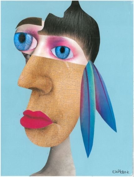
Inspiration: I'm attaching a few images for inspiration. Feel free to try out a totally new thing if something sparks your imagination.
it’s September 15th, 2022
I received new versions today! This is what the designer said:
first version:
I spent a lot of time searching for suitable sources of illustrated faces. But ended up stylizing the previous one, because everything I found felt off. The best eyes I found (I used them earlier) are black and white, so I've tried to color them in yellow, like in one of your inspiration images. Also I got rid of all other elements for now.
This is still very raw and needs a lot of work. But our main goal now is to achieve an approximate look of his face. What do you think about this version?


second version:
The first version lacks the comical/funny look, as I understood it was important. So maybe this exaggeration of his eyes can work?
Also I thought about some scribbles over the whole image. You know, like teenager's vulgar drawings in the school textbook. But I want to know your opinion about the current look first.
Note to self: I need some time to think about this. I’m going to go for a walk, and then look at these covers again, before I send my feedback to the designer.
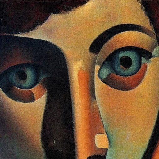
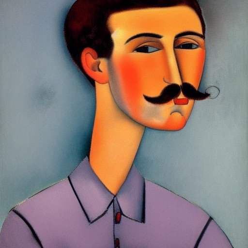
my feedback to the designer:
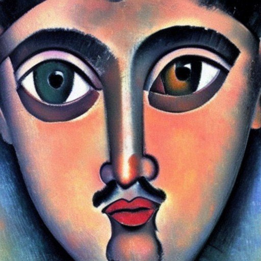
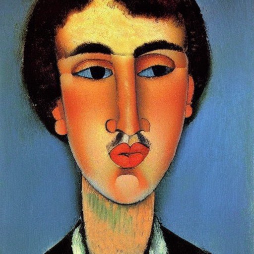
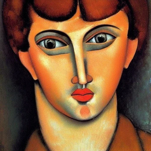
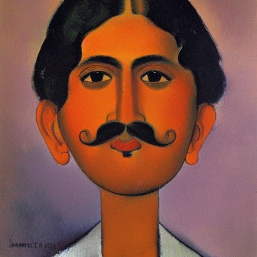
I agree, the eyes in the second version are better, though we need catch lights in them, to make them enticing. This cover needs a lot of work, so I have created a few sample portraits using artificial intelligence that could be used in the creation of the new version. The idea is to mix and match various parts of the face, only if they stand out, and work with the overall design. Here are the sample images:
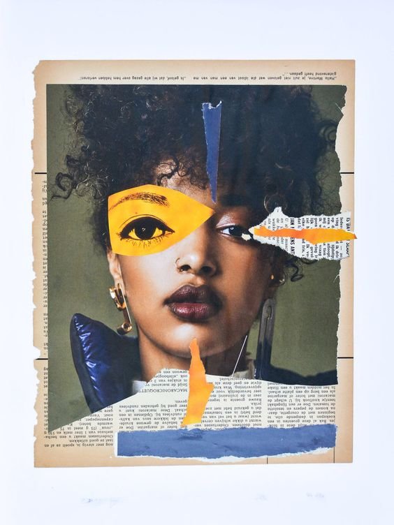
It’s September 23rd, 2022
I’m glad to say that we now have the three shortlisted book covers. These are drafts, so there’s still a lot of work that needs to be done. But at this point, we have to decide which cover are we going to further develop as the final version. Please help me do that.
Which one draws you in?
Which one makes you curious?
Which one is your favorite?
Please let me know in the comments below. Thank you so much, everyone!
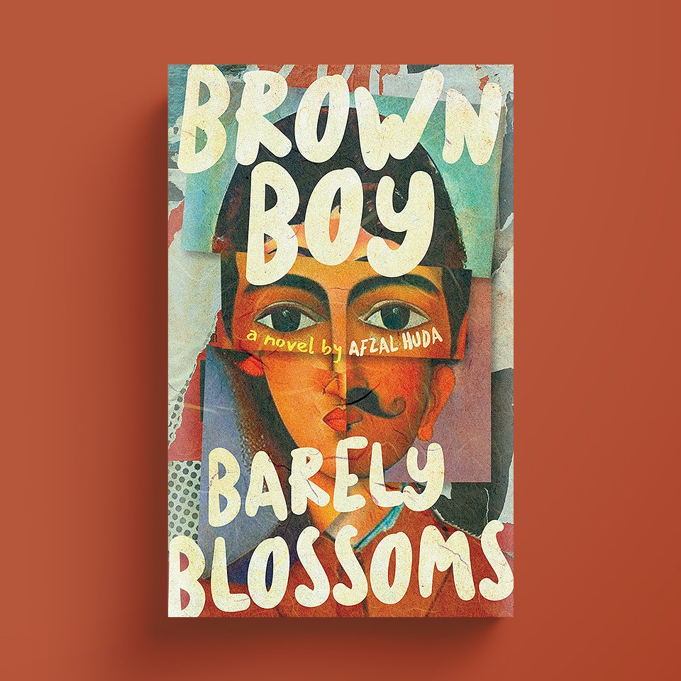
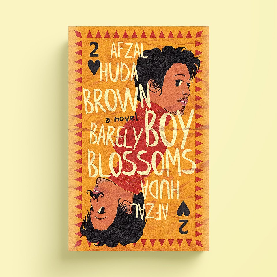
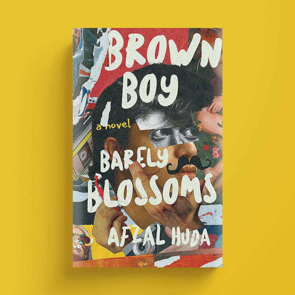
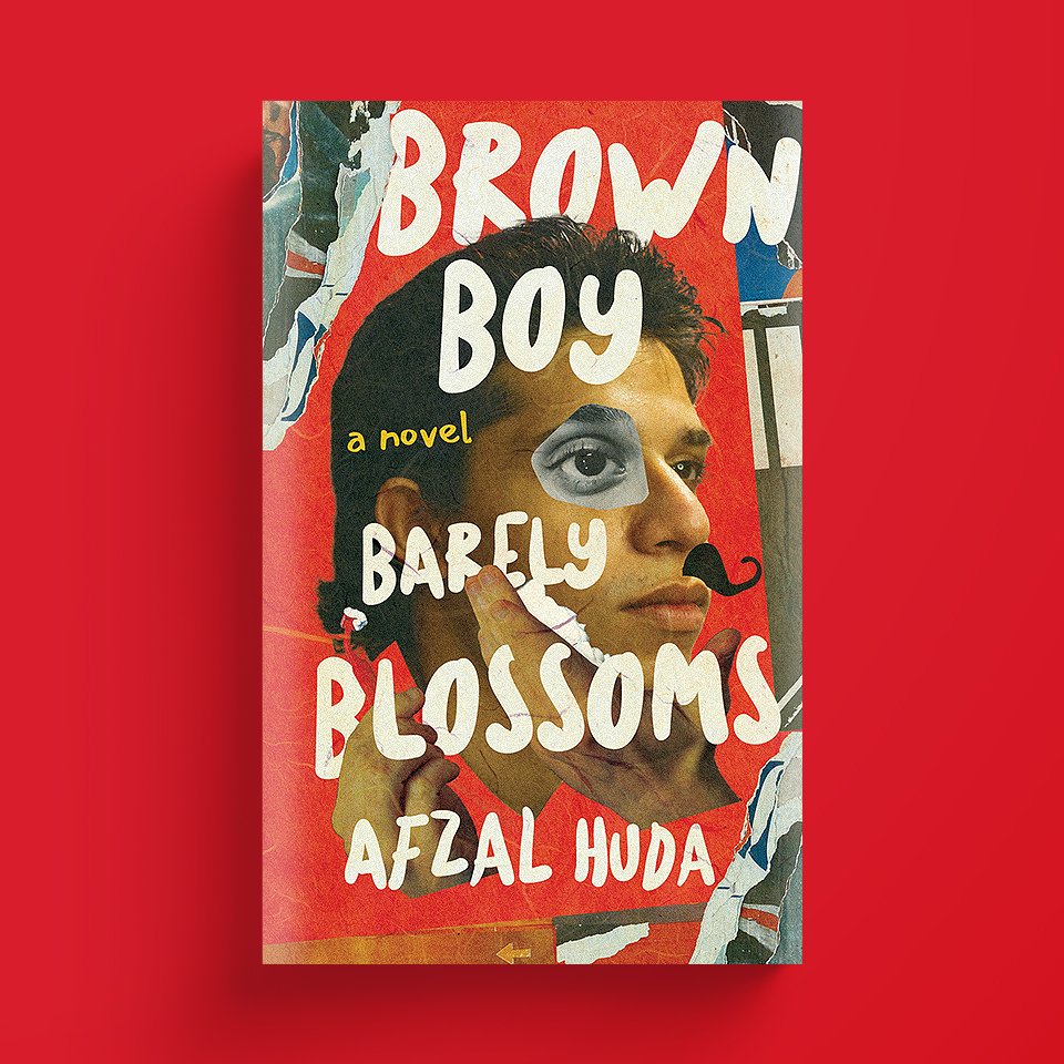
It’s September 29th, 2022
The votes are in! 99% of the people picked the first one. However, a few people were curious as to why we discarded the earlier title; Horny Boy. In addition, a few publishers/publicists advised us to add the yellow color to the cover, for better response (based on latest statistics.)
So I asked the designer to create two versions, and then we asked the readers to do another vote on Facebook. Here are the two new versions:
The majority still prefers Brown Boy Barely Blossoms, so we’ll go with that title. However, a few things came up during the voting. It appears that the title is hard to read, it’s confusing because the last two words Barely Blossoms are at the bottom. I have asked the designer to work on that. Let’s wait.
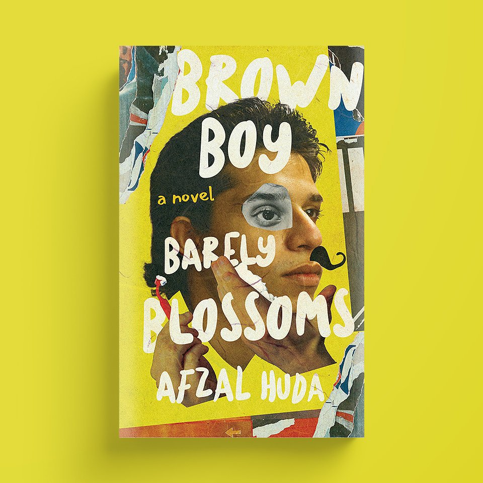
It’s September 30th, 2022
The designer sent a few variations:


my feedback to the designer:
I still prefer the earlier version of September 29th, and would like to continue working on that
Not a big fan of the pink and blue shades on the sides
I love that his clothes are made up of two colors (blue and orange,) in this version, so we should incorporate this component in the earlier version. This addition will work really well with the overall collage concept
I understand that in the earlier version, there’s not much room to have such a long title on the top, but I still want to see what it would look like
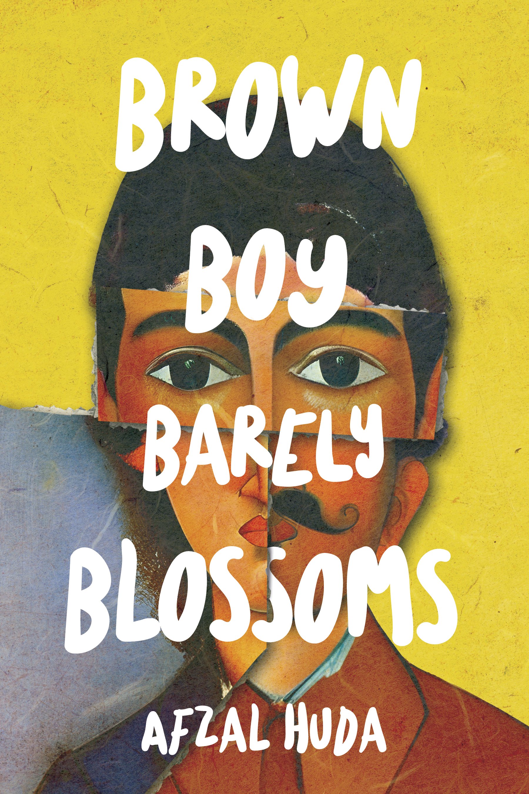
It’s all about the big eyes! They draw you in.

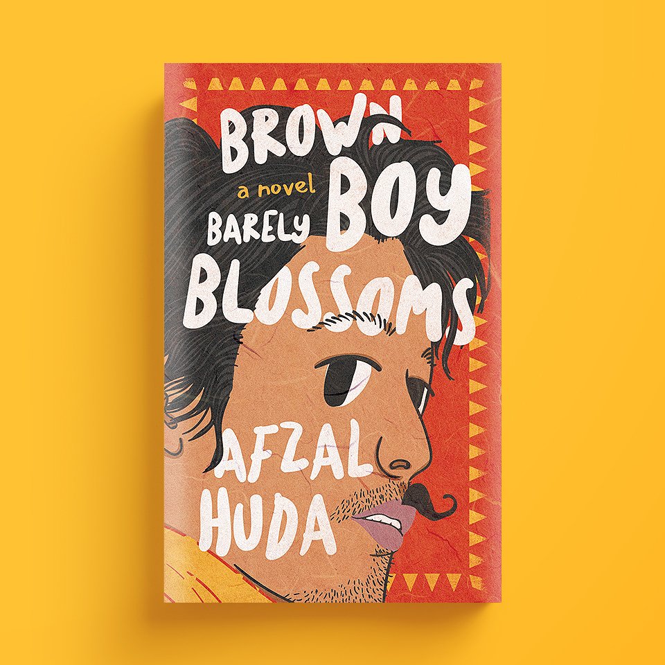
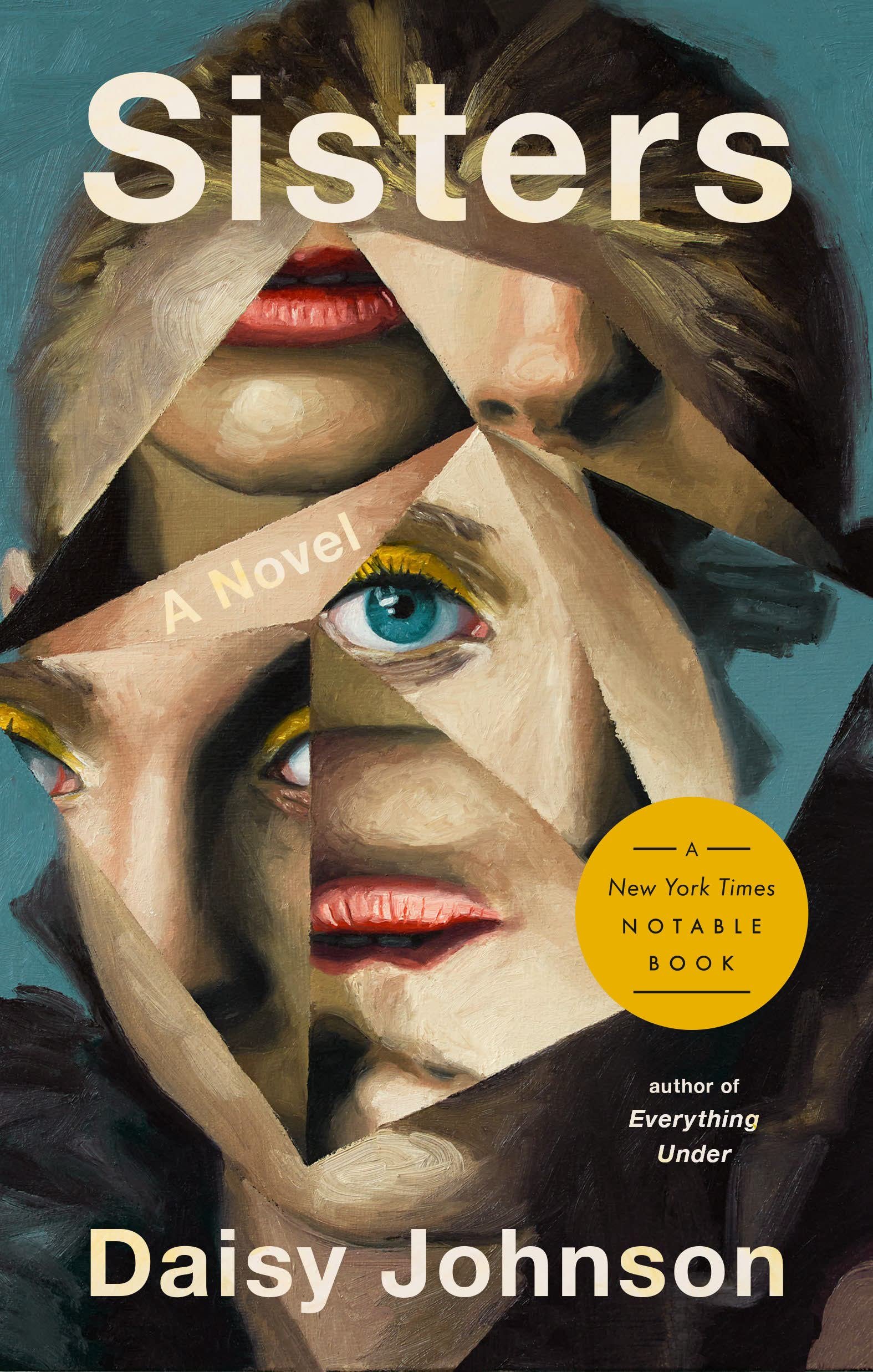
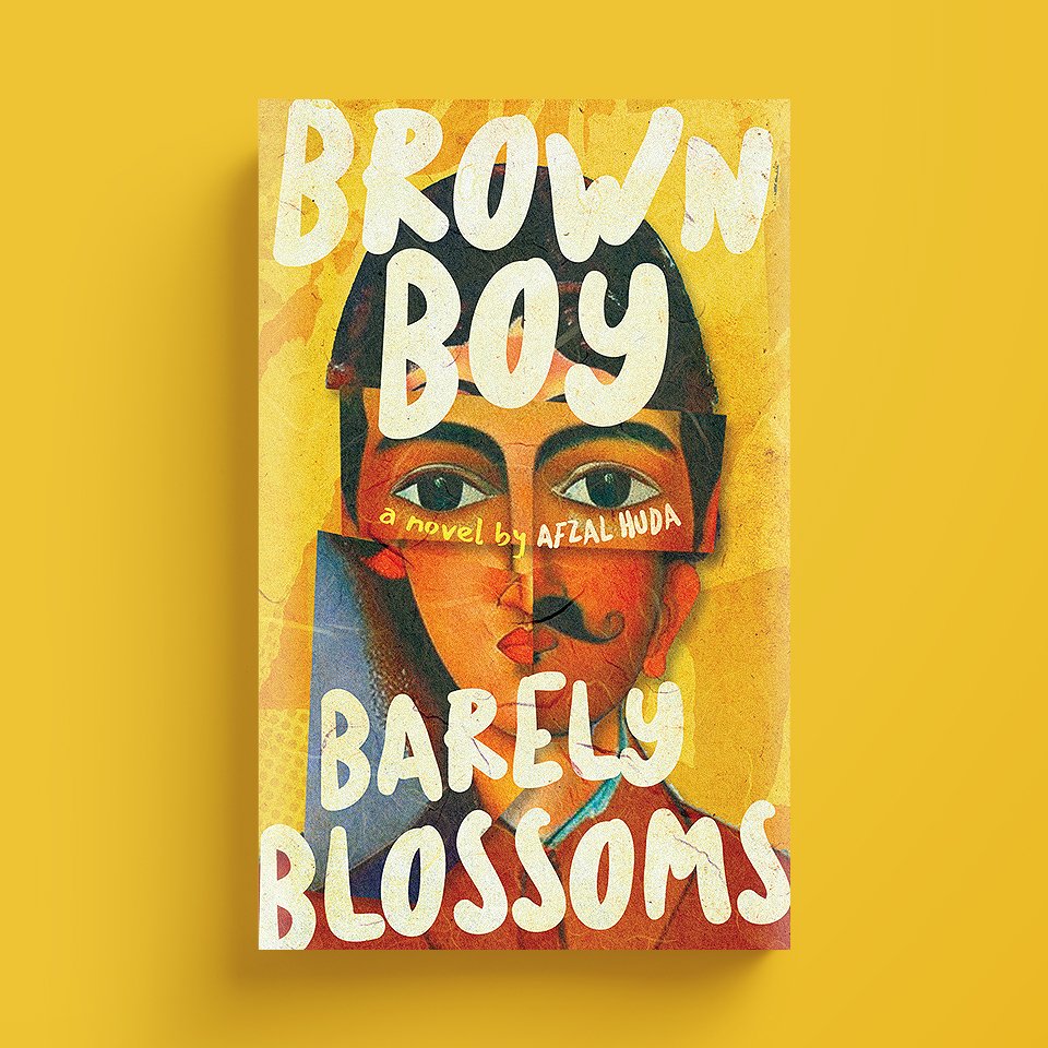
It’s October 6th, 2022
I’m proud to say that we have a winner here. This version is perfect. Now it’s time to start working on the spine and the back cover.
One last thing - I would like to make the yellow brighter. At this point, the cover appears too vintage and the "funny" part is missing. So making the yellow brighter will help with that. Maybe we can have a few shades of yellow that works well with the rest of the design.
And then you, the dear readers can help us pick the best one.
It’s November 19, 2022
Here are the finalized versions of the front and back cover.
It took almost three months to create the book cover. I learned so much along the way. It was such an amazing creative journey. I would love to do this again.
I would like to thank my designer, Ivan Kurylenko, who took a simple idea and turned it into a piece of art. I hope that he wins lots of awards and gets recognized for his creative work.
Good luck, Ivan!